














Pantone Color Matching on Merch: Set Realistic Expectations
Your brand color may not look identical on a shirt, cap and mug. Here is why, and how to get as close as possible.
 By Promogator Staff
•
•
4 min read

Brand teams care about color, and Pantone color matching is how most of them ask for it. You give a PMS number, the decorator mixes ink or picks thread to that number, and the logo comes out in your brand color. In practice, the result on a T-shirt, cap or tumbler can look different from the swatch in your brand book. Knowing why, and what to ask for, saves proof rounds and disappointment.
Why Pantone color matching on fabric is hard
The Pantone formula guides most designers use were made for printing on paper. As Screen Printing magazine explained, that is why the guides carry "C" colors for coated, glossy paper and "U" colors for uncoated, matte paper. Garment printers do not print on paper, and many of the garments they print are not white.
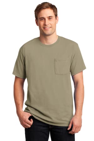
The same article describes what happens on a shirt. Ink soaks into the fabric, so a glossy "C" color tends to look closer to its matte "U" version once printed. On a colored garment, the shirt color shows through and shifts the ink. A heavy white underbase can protect the color, but it makes the print stiffer, which most people do not want on a soft tee. Pantone does make a fabric-based color system, but its swatches are on white fabric, so the same ink still changes on blue, red or black garments.
None of this means you cannot get close. It means the decorator needs the right information and you need to judge the result on the actual product.
What decoration method changes
- Screen printing uses mixed spot-color inks, so it can get very close to a PMS color on white or light garments. Promogator lists screen printing at up to six spot colors.
- Embroidery uses thread, which comes in fixed colors. Our imprint methods guide notes that thread colors are matched to your brand's Pantone colors, choosing the closest available thread. Thread also has a sheen that changes with the light.
- Laser engraving adds no color at all. The mark is the color of the material underneath, so plan for that.
- Full-color methods such as DTF, DTG and sublimation build colors from a set of process inks, which is great for photos and gradients but can drift on exact brand spot colors.


Fabric and garment color matter as much as ink
Cotton, polyester and blends absorb ink differently. Heathered fabrics mix fibers of different colors, which softens how a print looks. Dark garments need a base layer under the ink, which changes the final shade. If your brand color must look the same across several products, choose garments in similar fabrics and colors, and expect small differences between a tee, a cap and a mug.
How to get closer to your brand color
- Send PMS numbers with every order. Promogator's artwork guidance asks for Pantone numbers up front. If you do not have them, the design team matches the closest colors and lists them on the proof.
- Say which version you mean. If your brand book lists both coated and uncoated values, tell your rep which one is the reference.
- Name the garment color. The same ink on white, heather grey and navy will look different. Approve the logo for each garment color.
- Read the proof as a guide, not a color sample. A digital proof shows placement, size and the PMS colors specified, but screens do not show ink on fabric accurately.
- Ask about a physical sample when color is critical, such as a large uniform order or a rebrand launch.
Set expectations inside your company
Share a simple rule with the people who approve merch: printed color will be close to the swatch, not identical, and will vary a little by product and fabric. That expectation, plus clear PMS references, keeps Pantone color matching from turning into repeated reprints. Our rush services page also notes that including PMS colors up front is one of the easiest ways to keep an order moving.
Sources
Written with AI assistance and reviewed by Promogator Staff. Our editorial standards
Promogator Staff
Written and reviewed by the Promogator team. Our editorial standards
Products mentioned in this article
Live pricing — updated Nov 18, 2026.
Need a quote?
Tell us what you have in mind and we will come back with pricing, lead times and options — no obligation.



